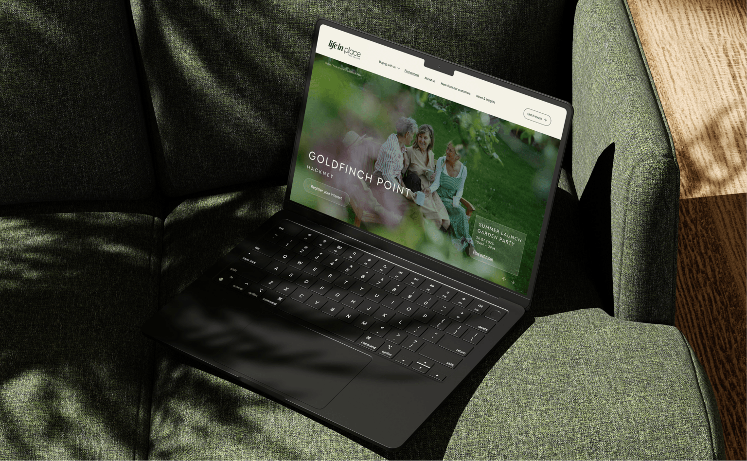
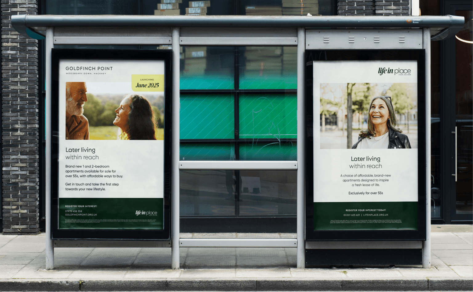
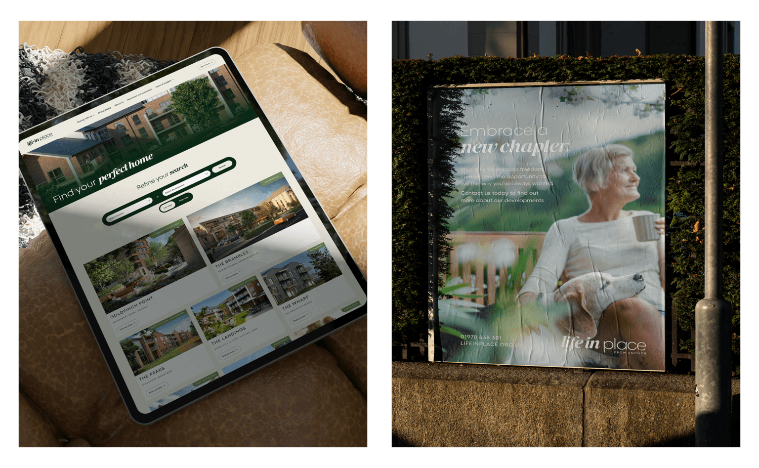
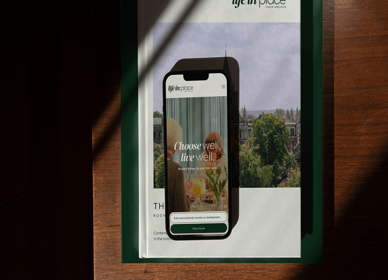
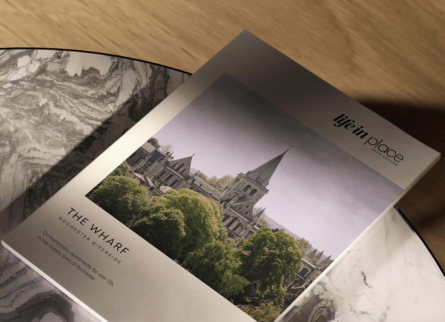
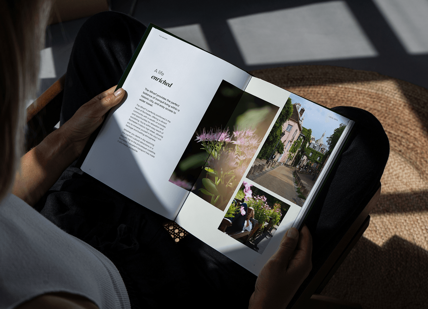
With new developments and offerings in private sale and Shared Ownership on the horizon, a cohesive brand identity was needed for Anchor New Homes that reflects Anchor’s values, achieves market standout, and resonates with their target audience.
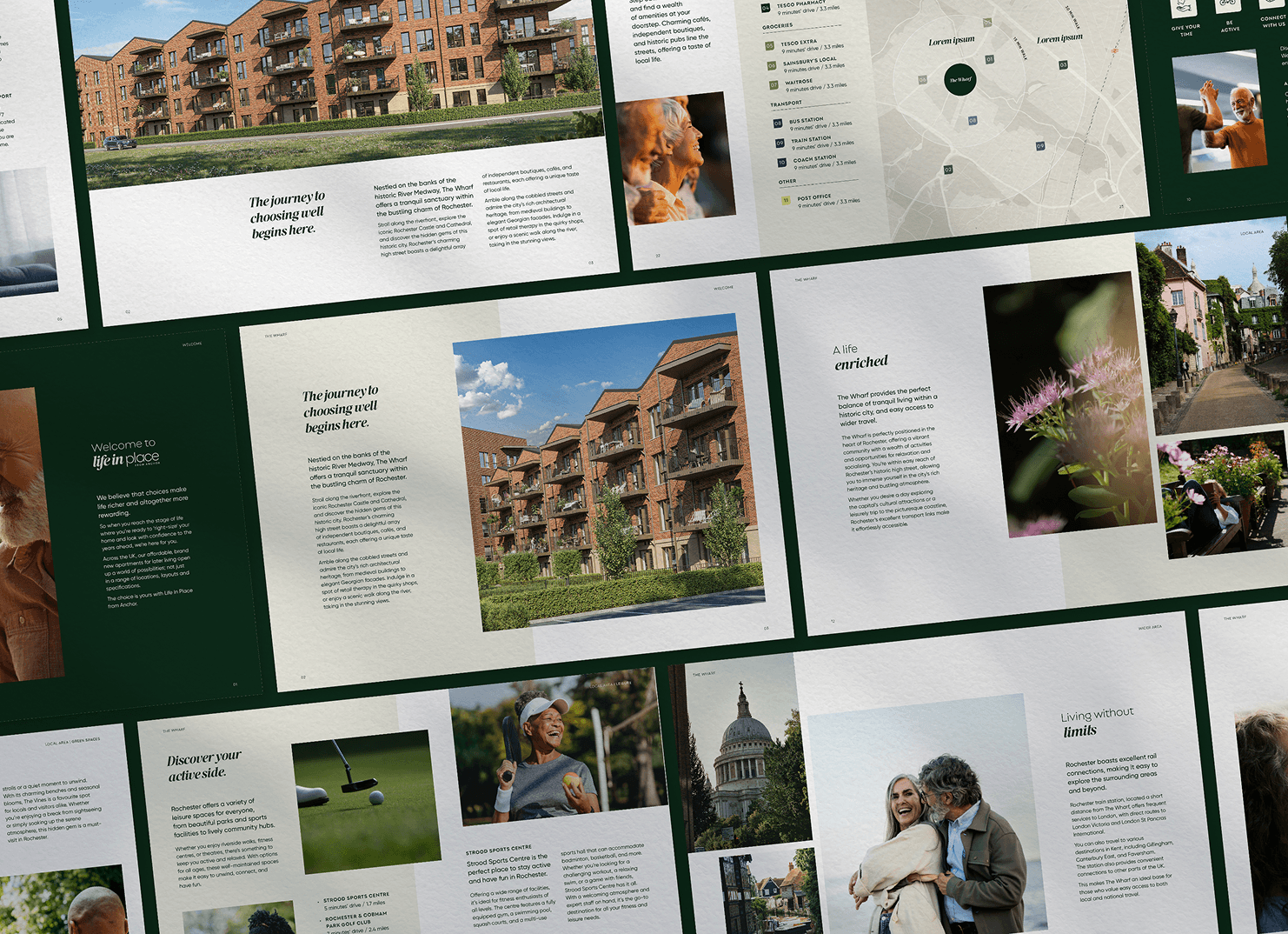
Welcome to Life in Place. It’s engaging, human and authentic. Our chosen typefaces, a serif and sans-serif combination, and logo inject life anew into the brand while connecting back to Anchor. And our colour suite conveys the very warmth, quality and care you can expect.
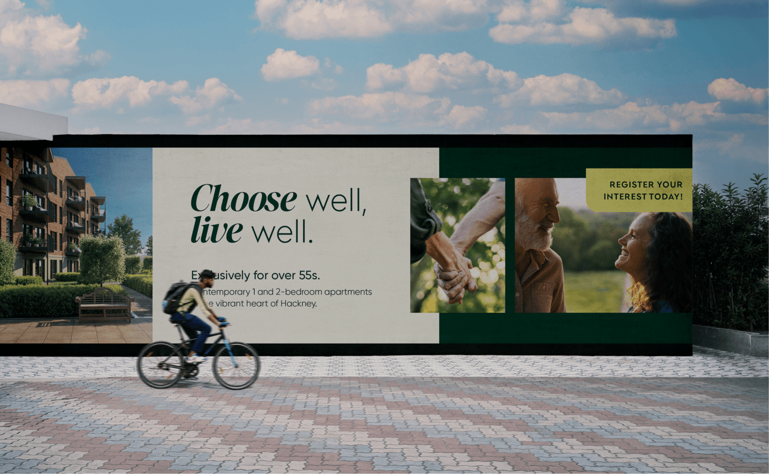
Across the collateral we’ve produced – digital, print, video, signage and more – a clear and compelling story emerges: Life in Place is where you can look with confidence to the years ahead.
We believe that choices make life richer and altogether more rewarding.
So when you reach the stage of life where you’re ready to ‘right-size’ your home and look with confidence to the years ahead, we’re here for you.
Across the UK, our affordable, brand new apartments for later living open up a world of possibilities. Not just in a range of locations, layouts and specifications, but tenures too.
So if you’d prefer to rent, buy or opt for Shared Ownership, the choice is yours.


No matter which route you take, you’ll get access to all the tailor-made services and benefits that make us truly special – from our guest suites to our wellbeing programme.
Not to mention a new community of friends you haven’t even met yet, and new places to explore. It’s all ready and waiting. All you have to do is choose the future you’d like to live. Then relax and leave the rest to us.