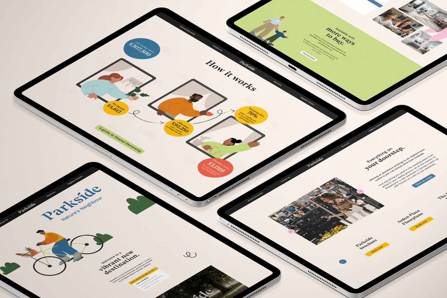
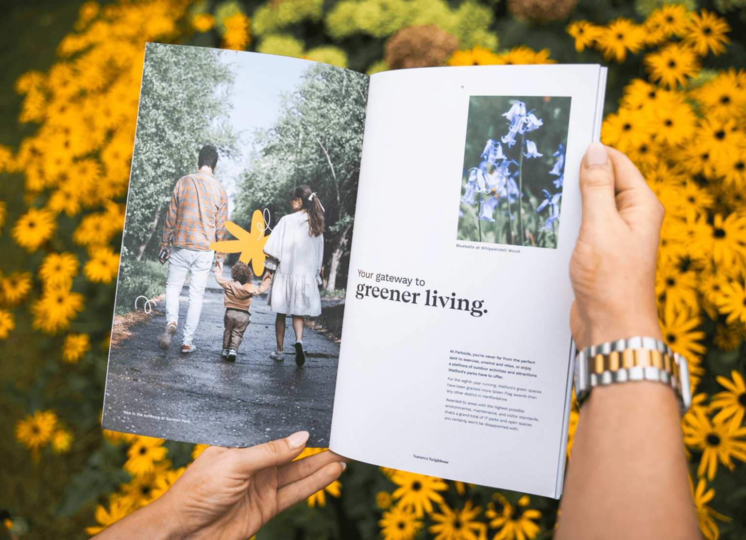
Parkside is more than just a place to live, it’s a space for growth, relaxation, connection, and tomorrow.
We recognised that Parkside is not just a residential space, but a vibrant community where individuals can thrive, unwind, connect, and envision a brighter future. Our goal was to create a brand identity that encapsulates these core values and resonates with the target audience who are interested in stepping onto the property ladder with Shared Ownership.
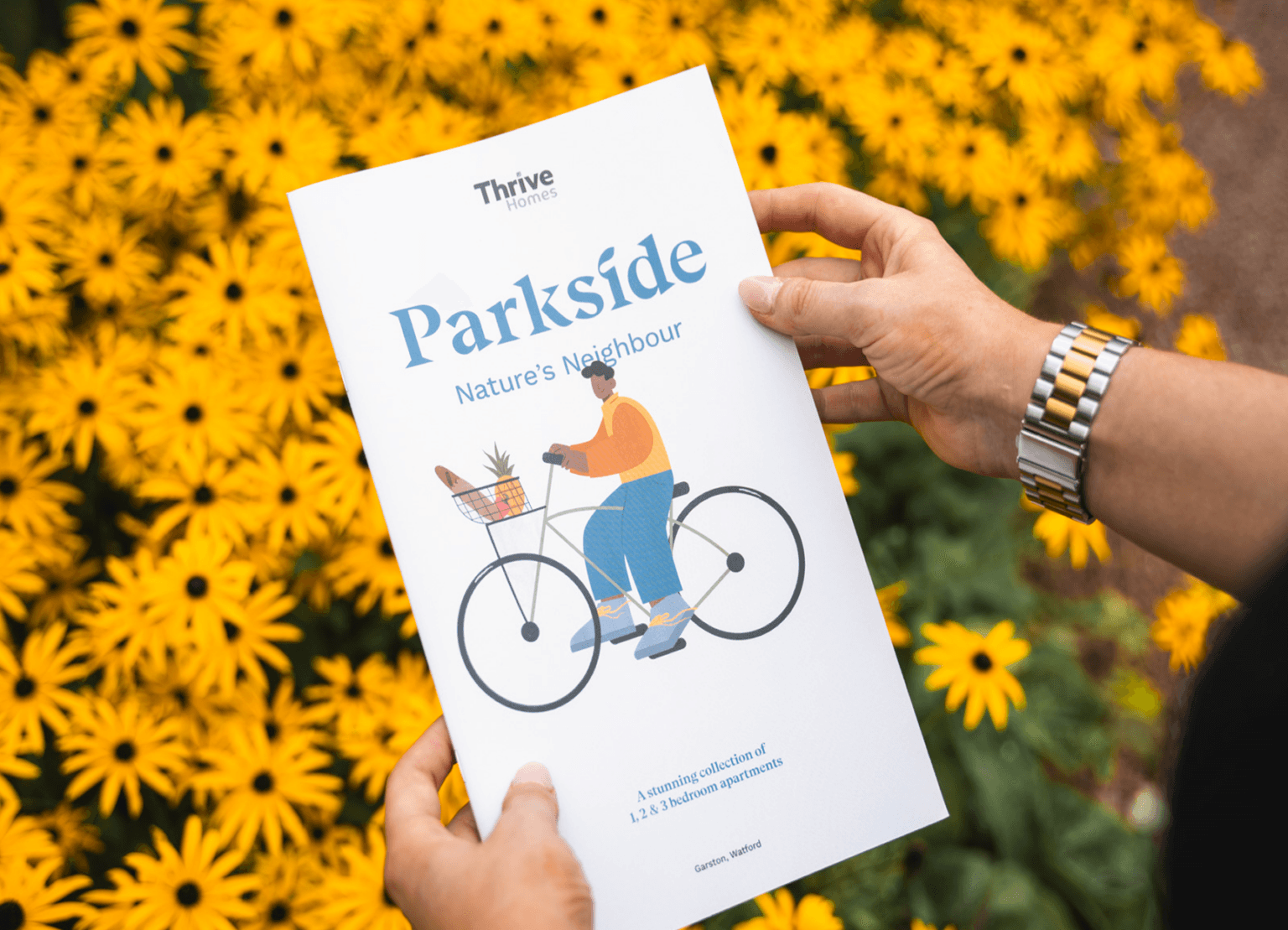
Parkside’s identity is celebrated with a logotype that was handcrafted to combine human warmth with modernity, representing a place where the bustling city life harmoniously coexists with the serenity of nature. The combination of organic and geometric elements in the logotype brings to life the dynamic blend of urban living and natural surroundings that Parkside offers.
The strapline, ‘Nature’s Neighbour’, encapsulates the unique positioning of Parkside. It serves as a succinct and powerful expression of the brand’s commitment to harmoniously coexisting with the natural environment, and living in a place that seamlessly integrates with its surroundings.

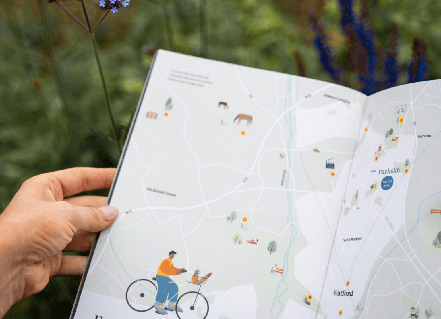
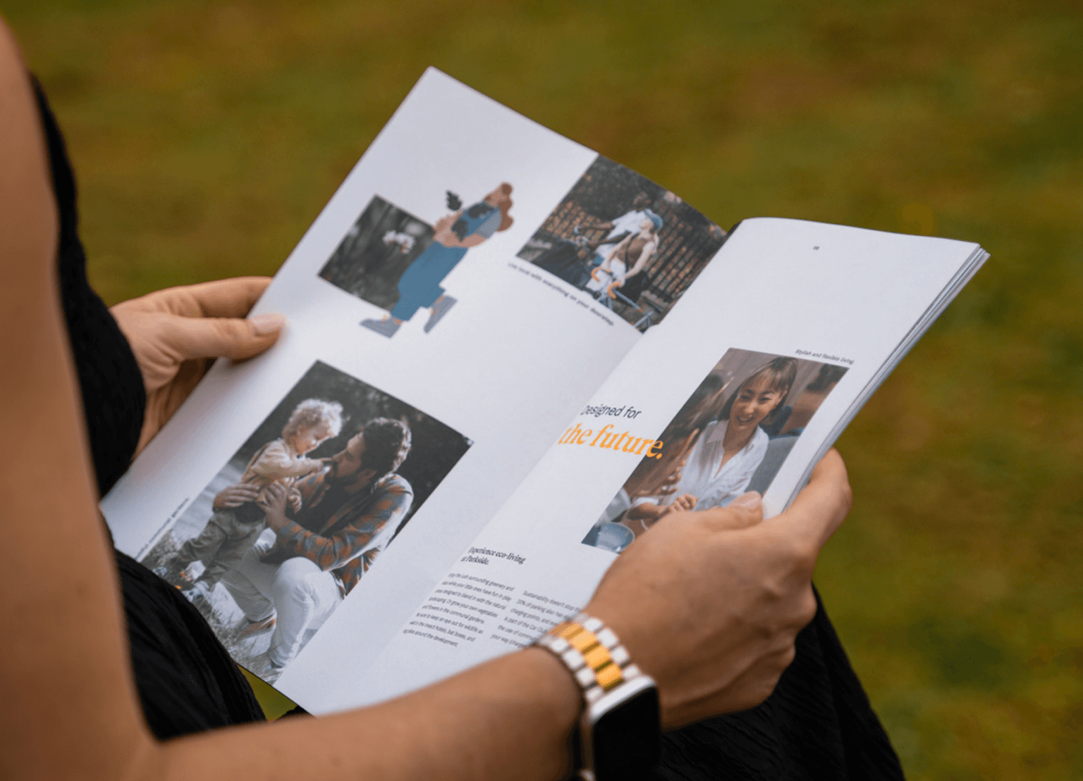
Our branding approach for Parkside is rooted in the belief that a successful brand identity should not only capture the essence of a place, but also relate to the experiences and aspirations of its target audience. Through our thoughtful design choices, we aimed to create a brand that not only stands out but also resonates with individuals who seek a fulfilling and connected lifestyle. Overall, the launch is a success. Our branding helped Thrive Homes stand out from the competition as it was engaging customers. Everything to establish Watford as a vibrant destination to live in, built for the way we live, rent, and own today.